 News
News1 March, 2025
Weeks to Launch: 3
We’re back with another exciting newsletter in anticipation of AOPA-Retrospective 1.0’s elusive upcoming launch!
Last time, I introduced you to the Taxonomy Main Page and spoke about some of the ways artworks can be grouped. This week, we’re taking a look at how AOPA-Retrospective 1.0 represents artists in the About section. This page brings together in one place three important content blocks:
Presently, AOPA’s senior WordPress programmer Valeriu Tihai (who we met back in our second issue) is hard at work programming these templates. They should be done any day. In the meantime, I’ll tell you what to expect.
Oh, a little heads up… You’ll notice that we decided to use some technical images to illustrate this newsletter. They are the annotated mockups that Don prepares for Valeriu to communicate what needs to go into the programming of a template. I’m hoping that they will give you some more insight into the production process.
We would like to thank Karen Trask again for the use of her design templates for this newsletter.
BTW, if you’re getting something out of our newsletters, share our sign-up page with friends! New readers can sign up here.
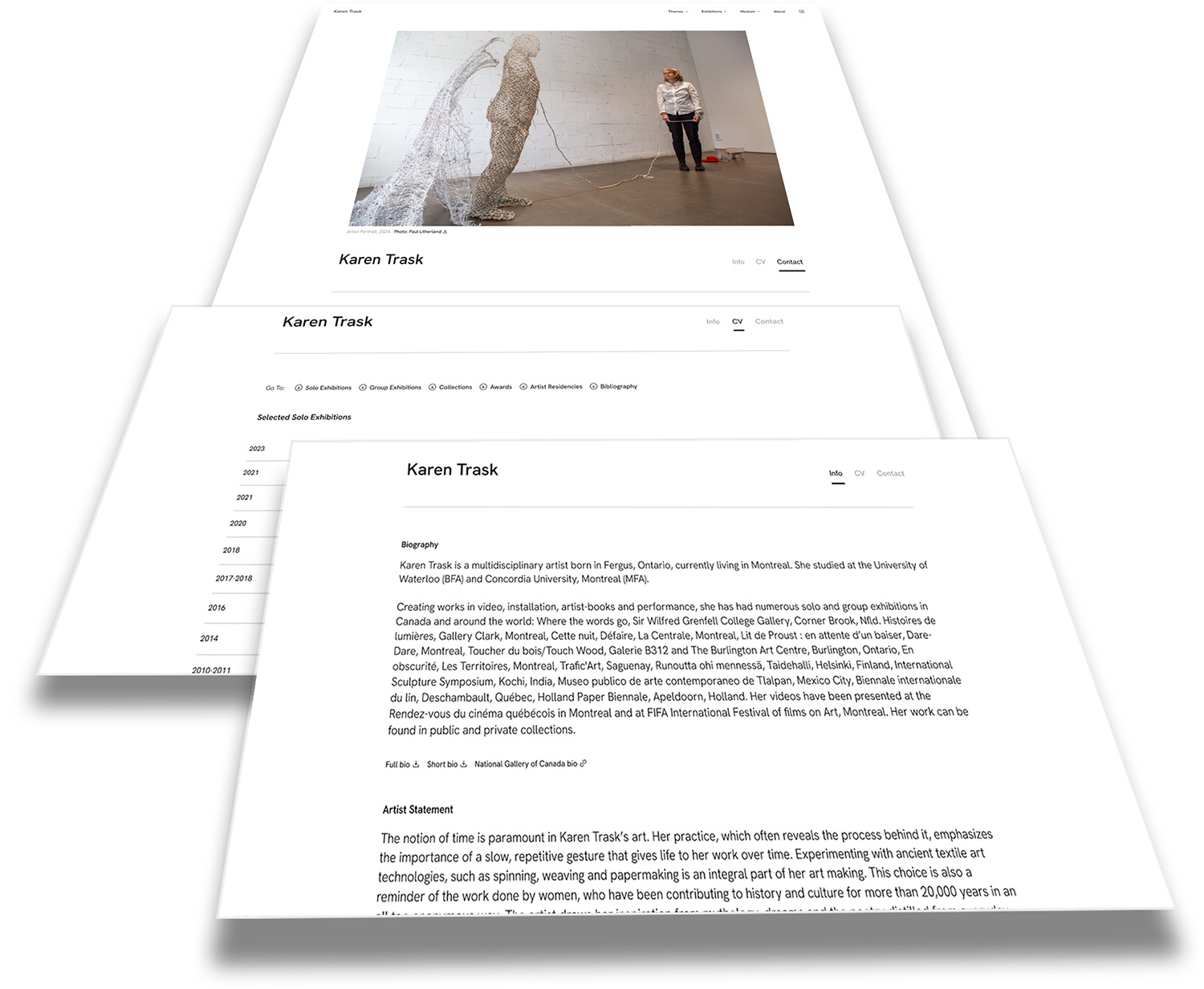
Montage showing the design storyboards for the three sections of Karen Trask’s About Section..
Starting with the very top of the page, the first thing users will see when they land on the About section of a Retrospective, is a portrait of the artist or another representative image or video. This could be a clip from an interview, a shot in the studio or a still from a performance, something that quickly conveys who they are. By putting a face to the name, users are set up to get to know the artist as a person and a creator.
Like other media in the AOPA-Retrospective platform, this image or video will have a caption with photo credit and a link to download the high-res version (useful for when a gallery, festival or publication needs an image for their web or print materials). Look familiar? That’s because it was modelled after the highlighted media in the Artwork Single template I introduced you to in one of our first newsletters.
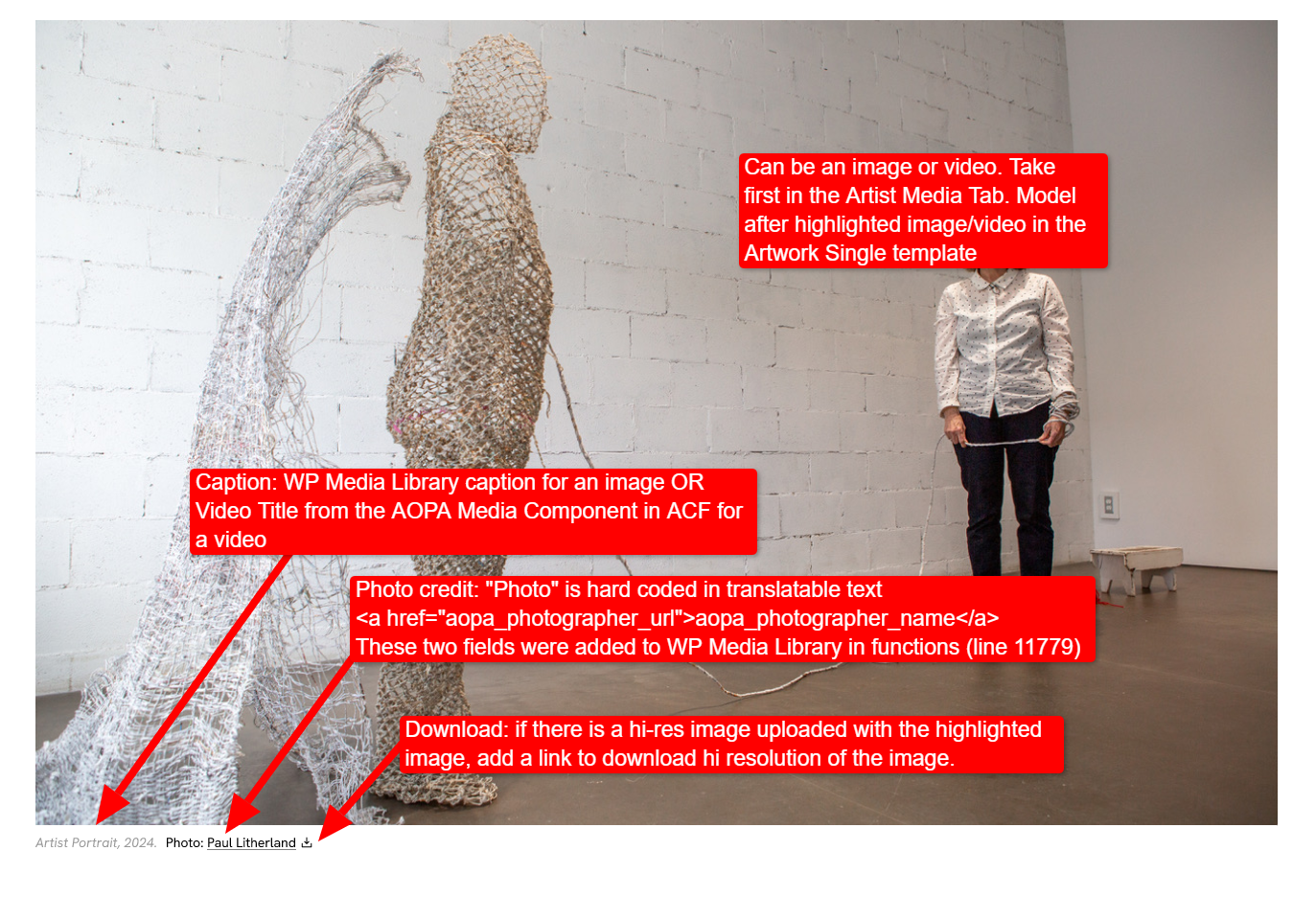
Graphic layout showing the header for the About page with annotation for programming the template.
Right below the artist’s portrait are three tabs, which allow users to easily navigate the main content areas assembled on the page: Info, CV, and Contact.
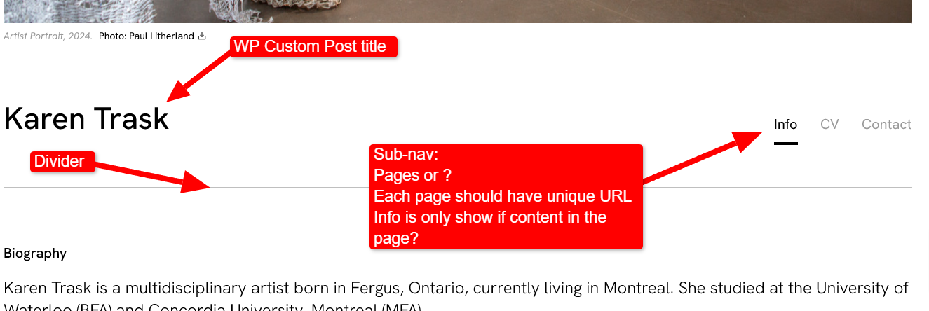
Graphic layout showing the sub-navigation for the About page with annotation for programming the template.
These tab links, as well as all the content blocks I will be telling you about, only show up if there’s content in them. Furthermore, each tab has its own URL. That means if you want to share your CV with a curator, for example, you can send them directly there without having to guide them through your site. One click, and they’re in.
The “Info” section has two parts:
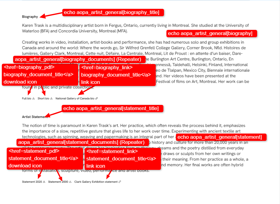
Graphic layout showing the bibliography and artist statement blocks of the About page with annotation for programming the blocks.
The Biography is pretty straightforward. It’s a place for artists to share their story, e.g. where they come from, and how they’ve arrived at making art. The bio is entered in a WYSIWYG text field, the length of it and how in depth you want to go are up to you.
The subheading is customizable. Although “Biography” is a classic, it could be replaced with something written in more of a headline style or injected with a personal flare. “My foray into the art world” might be more your speed, or even just “Bio” if you like to keep it short.
The Artist Statement works the same way. Artists can input their custom subheadings, a statement of their choice, and edit these text fields as needed.
While these are consistent features across most artists’ websites, AOPA has taken care to go the extra mile…
It’s not uncommon for artists to have several iterations of their Artist Statement and Bio. These are texts that are requested by galleries, for grant applications, residencies, and more, so they’ve likely been rewritten many times over.
That’s why AOPA-Retrospective 1.0 has the option to make available downloadable PDFs of documents and links for additional versions of biographies and artist statements. There could be extra-long and extra-short versions of your bio, a link to your university or gallery profile, older versions of your statement, what ever you think is worth sharing.


Examples of links to webpages and to downloads that could be used in the biography and statement blocks.
Going back to our curators, critics, art historians and collectors, or “CCACs”, these statements and detailed biographies showcase useful information about the artist. Not only do they provide the basic information about an artist’s life, experiences and artistic priorities, but they also hold a backlog of archival information centralized in one location.
Next up: the CV tab. This tab holds a lot of information, so we’re going to break it down.
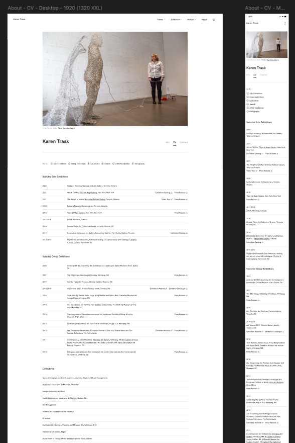
Graphic layout for the CV page of Karen Trask’s website.
We’ve talked in previous weeks about the interconnections in the content put into an AOPA-Retrospective. The CV is no exception.
Major sections of the CV — Exhibitions, Publications, Collections, and Grants and Prizes — are automatically generated from selected data that was entered to create the Artwork and Exhibition pages. By entering metadata in one place, it appears in all of the other relevant spots. This way data is only entered once, which guarantees consistency across the website, while minimizing work.
To help users navigate the sometimes quite long CV page, there are anchored links that jump down to each of the CV’s main sections when clicked.

Graphic showing sub-navigation for a CV.
AOPA-Retrospective 1.0 has five different exhibition types. Each exhibition is given a type when it is created. Each type has its own grouping in the CV:
For each Exhibition entry, the system pulls from the Exhibition post the following:
A list of exhibitions is created, displayed in reverse chronological order with the most recent entries at the top.
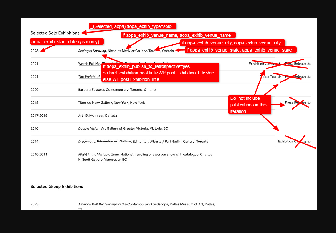
Graphic layout showing the solo exhibition block of the About page with annotation for programming the block (note for the graphic mockup the content for this section was copied from another AOPA website and is not for Karen Trask).
This gathering of data about exhibitions and linking it to the Exhibition pages is not only useful for artists. For CCACs, this streamlines the processes of art research and fact-checking. If they find an entry that interests them, they can go directly to the exhibition, straight from the CV, to get all the details and see images. That’s more information with far fewer clicks!
The Publications portion of the CV works in much the same way. Like Exhibitions, this section is generated from what’s already been entered into the system, efficiently making data clear and consistent across all areas of the site.
AOPA-Retrospective 1.0 has 9 different types of publications, including: Books, Monographs, Exhibition Catalogs, Reviews, Articles, Pamphlets, Interviews, Dissertations and Webpages. Publication entries are sorted into these categories under their respective subheadings, depending on how each one has been categorized.
Every publication is displayed with its bibliographic reference, a link to the full-text download if it’s been uploaded to the system, as well as a link to the publication if there is one.
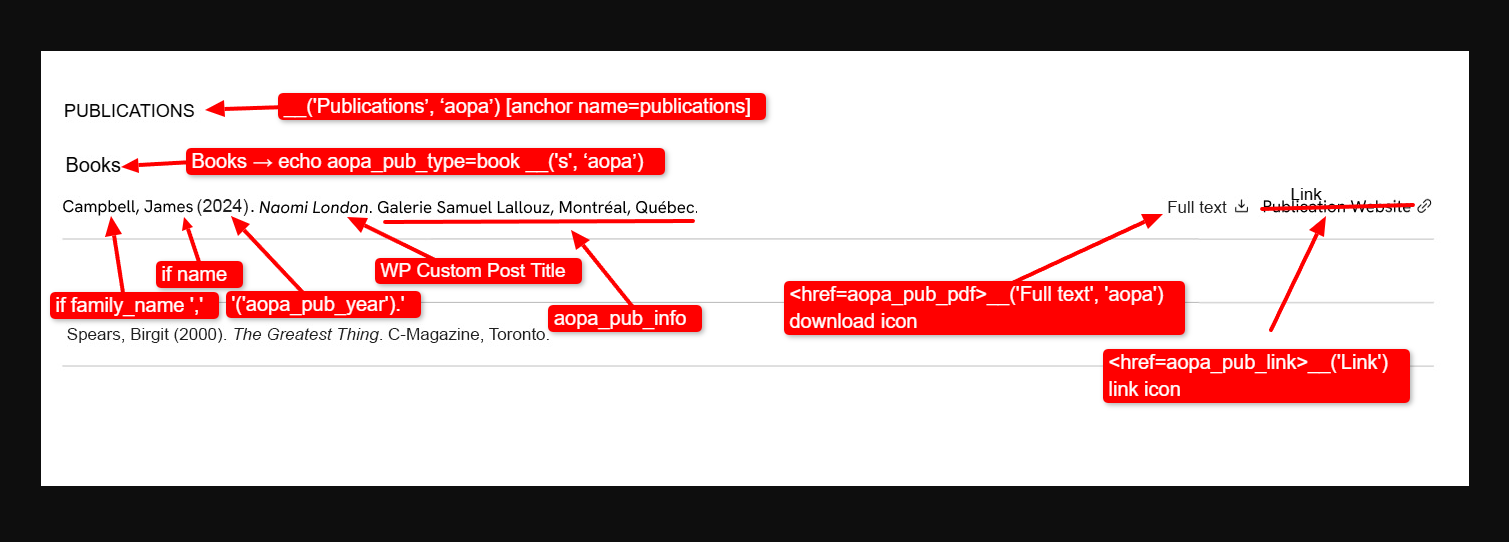
Graphic layout showing the Books subsection of the Publications block on the About page with annotation for programming the block.
Putting all this data into AOPA-Retrospective is a process. So, if you or your dedicated curator realize, for example, that a publication was improperly categorized, or has bibliographic information that’s not quite right, don’t worry! It will become clear when you see it compiled in the CV, and you can go to the post to make any corrections required. The publication will then automatically be sorted and displayed properly.
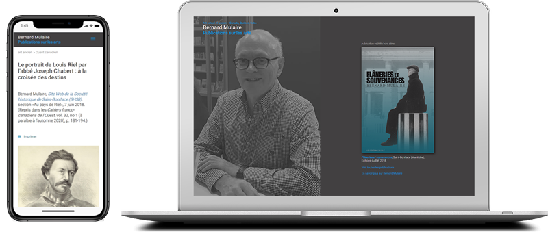
Graphic showing Bernard Mulaire’s arts writing website on mobile and portable screens.
Before we finish with publications, I have some inside information on a future iteration of AOPA-Retrospective… I heard from Don that AOPA has future plans for creating a “Publication Single” page so that we can also create online retrospectives for art writers! Not sure what that could look like? Check out this example of a website for art writer Bernard Mulaire made by AOPA (it was made some time back and is hand coded!).
By now, you’re probably getting the gist of things. Entries in the Collections section include the title of the collection. Note that only public collections are listed here.

Graphic layout showing the Collections block on the About page with annotation for programming the block.
Grants and Prizes are split into a Grants section and a Prizes section. The entries display the name, granting body and year awarded.
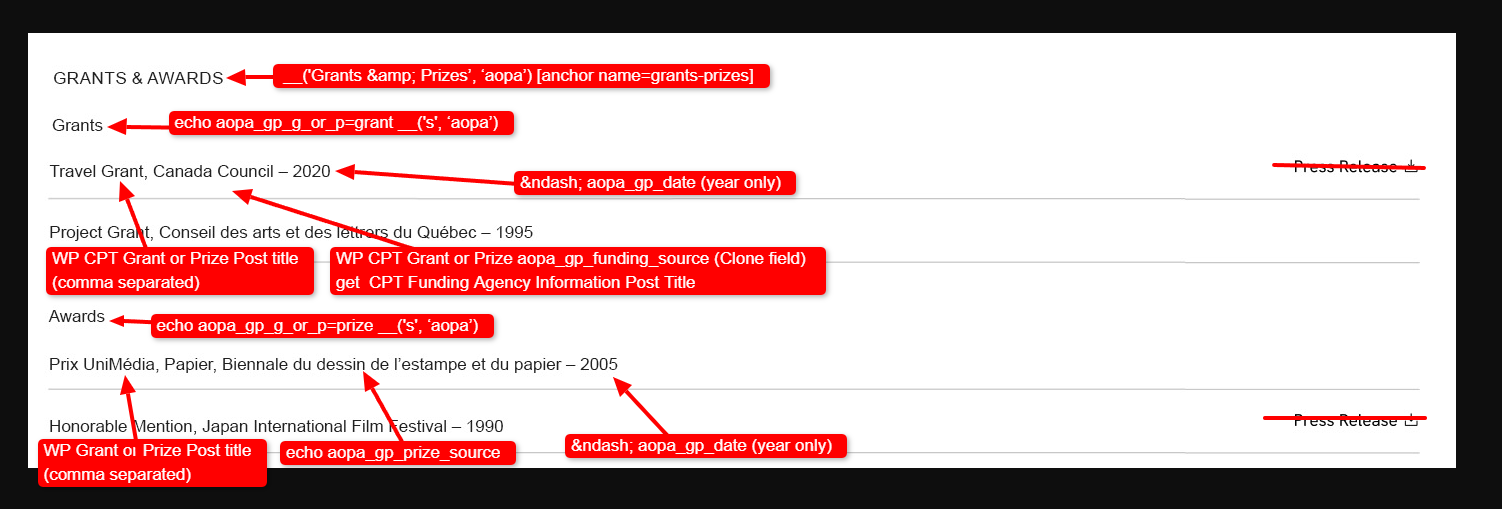
Graphic layout showing the Grants and Prizes block on the About page with annotations.
Just like in the previous sections, all of this information is generated automatically from data already input into the platform. It’s not magic — it’s just good code.
The automatically generated portion of the CV already holds a lot of information. But that doesn’t tell your whole story. Items like Teaching History, Conferences, Artist Residencies, Education and any other category can be added manually as custom sections to the CV.
Each of these sections will have a heading of your choosing, and as many entries as desired. There are data fields for a year, a description, a related document, and a related link. This makes it not only adaptable to your needs but thorough too, giving ample room for the information you consider pertinent to your curriculum vitae.
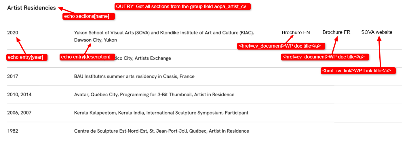
Graphic layout showing an example of the Custom CV section block with annotations.
Onto the third and final content area of the About portion of the site, the Contact tab.
You can choose to share your email, social media links, and the contact information of representatives like dealers and agents. We respect your privacy, so you need only provide the contact information you feel comfortable sharing.
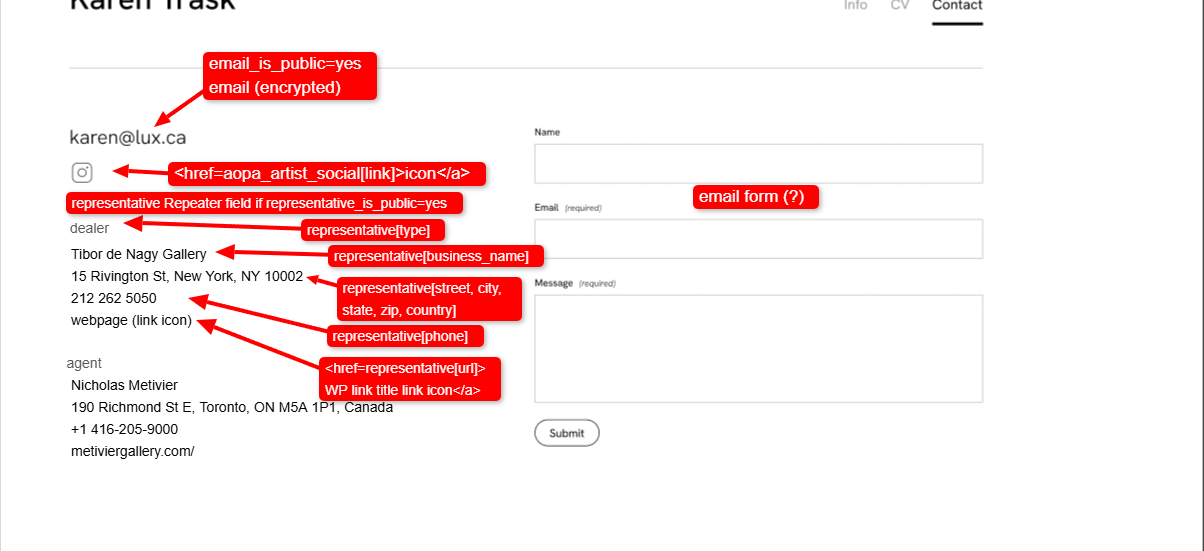
Graphic layout showing the Contact section of the About page with annotations.
Before we finish, I have another inside scoop on a potential feature for a future iteration of AOPA-Retrospective I’d like to share!
With all due respect, in our system Artists are seen as data objects just like Artworks and Exhibitions. Each has their own descriptive metadata and artworks, that’s what we’ve been looking at in this newsletter. As you have seen Artist profiles are where all of their “About” information is held. That means that theoretically Retrospective can accommodate many artists in the platform.
We are currently discussing whether in a future iteration, there will be templates created for presenting websites for exhibitions with multiple artists. The artworks from several different artists can all be shown on the Exhibition Single page, as well as having pages for each artist with the artworks they presented in the show.
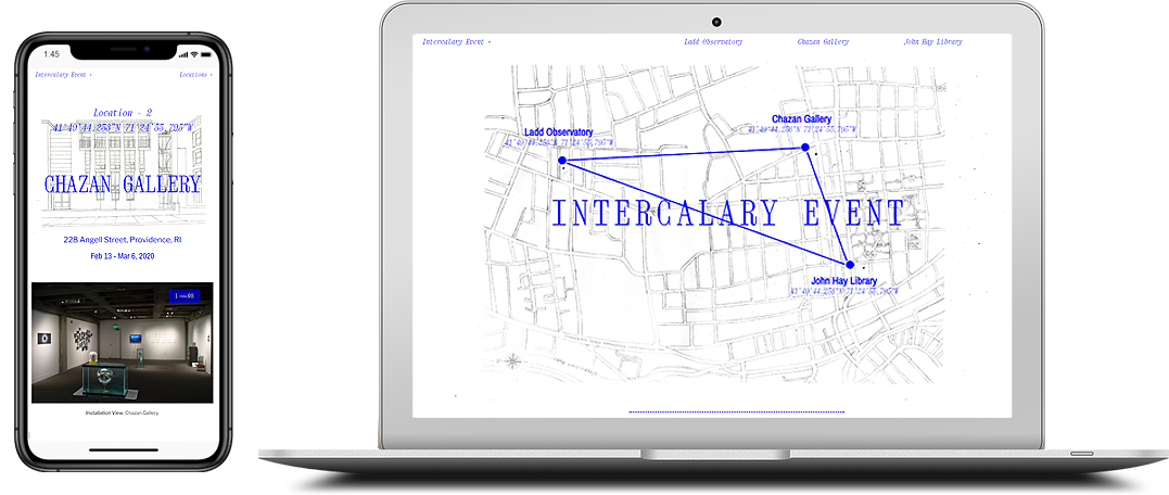
Graphic showing the Intercalary Event exhibition website on mobile and portable screens.
Are you interested? To get a better idea, here’s a project created by AOPA and designed by Derek Schusterbauer and Don, which could serve as the prototype. It is a virtual exhibition done for the Intercalary Art Event, which happened during the Pandemic and could not actually receive visitors because of lockdowns. Virtual exhibitions could be the future.
As always, thanks for reading! With every newsletter, I hope that AOPA-Retrospective 1.0 gets a little clearer in your mind… and that you keep getting more excited about the launch! It’s a pleasure to share the process with you.
At times, it may seem never-ending. But don’t fret! There is only one more template left to program: the “All Artworks” page. There is light at the end of the tunnel, and I’ll be here to keep you updated until we get there.
Have something to share with us? Want to pose your burning questions? Get in touch, we always love to hear from you.
Enjoying the newsletters? Share the sign-up page! It’s the best way to spread the word and get friends and colleagues up-to-date with the platform.

Mya Fernandes-Giles, AOPA Dedicated-Curator Assistant
Master’s student in Art History at Concordia University, working on a project that relies heavily on alternative archives. Has a great appreciation for record-keeping and cultural preservation, especially amongst little-known artists and communities. Recipient of the Concordia Merit Scholarship, the Guido Molinari Prize in Studio Arts and the Sarah Leaney Award in Ceramics and Fibers.
Artist Online Presence and Archiving (AOPA), provides professional online archiving and web-development services to mid- to late-career contemporary visual artists. AOPA was founded in 2023. It grew out of the freelance work of Don Goodes, who was an art critic and curator in Canada for a decade before moving over to web development in the cultural sector. AOPA delivers its services via a growing team of freelance writers, curators and designers spread across Canada. Over the past 2 years, the core team has been developing a flexible and comprehensive online platform called AOPA-Retrospective, a key tool in delivering AOPA’s services. AOPA-Retrospective is designed to fulfill the needs of contemporary artists, for both archiving and the online presentation of their oeuvre in the spirit of the catalog-raisonné.
For questions or inquiries see our contact page. We would love to hear from you.
5 February, 2025
Weeks to Launch: 4
Welcome back to another issue of the AOPA-Retrospective Launch 1.0 newsletter! We’re officially a month into 2025, and we here at AOPA are hard at work in anticipation of the platform’s reveal.
Last time, I introduced you to the Exhibition Single page where an artist’s works can be viewed by their exhibitions. But what about the other ways their oeuvre can be categorized?
Can artworks be grouped by those elements as well?
The answer is “yes” and is found in the Taxonomy Main and Taxonomy Single pages! Allow me to explain.
Enjoying our newsletters? Share the news! New readers can sign up here!
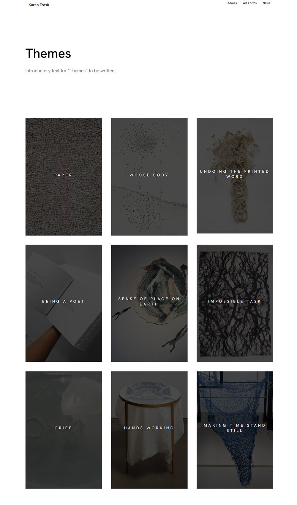
Screen Capture showing the Taxonomy Themes Main Page of artist Karen Trask’s retrospective.
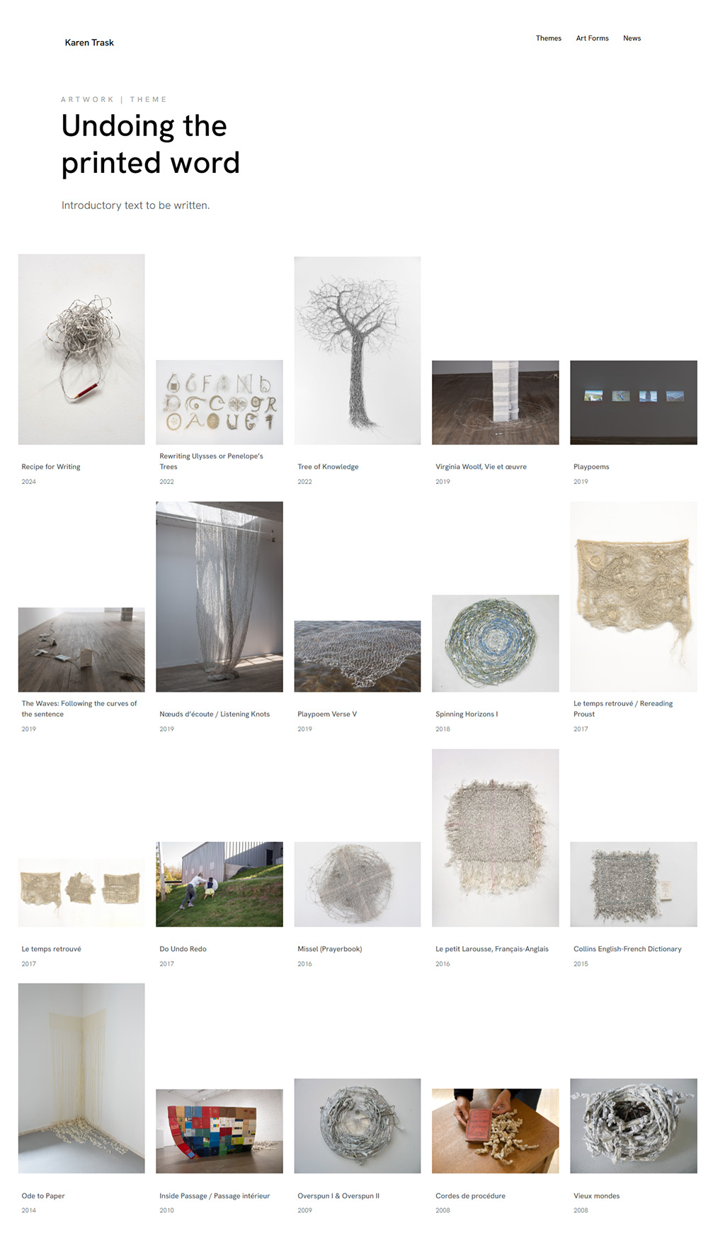
Screen Capture of Karen Trask’s Taxonomy Single Page for the theme Undoing the Printed Word.
It’s not as obscure as it seems! Taxonomy is just computer-world jargon. Don and Valeriu use it all the time. Alex, APOA’s designer, even started to use it. And I’m getting used to it too!
It is a word in data science that was borrowed from biology for classifying things based on shared characteristics. For AOPA, it’s pretty simple.
AOPA-Retrospective 1.0 has three built-in Taxonomies:
If you have others, they can be created.
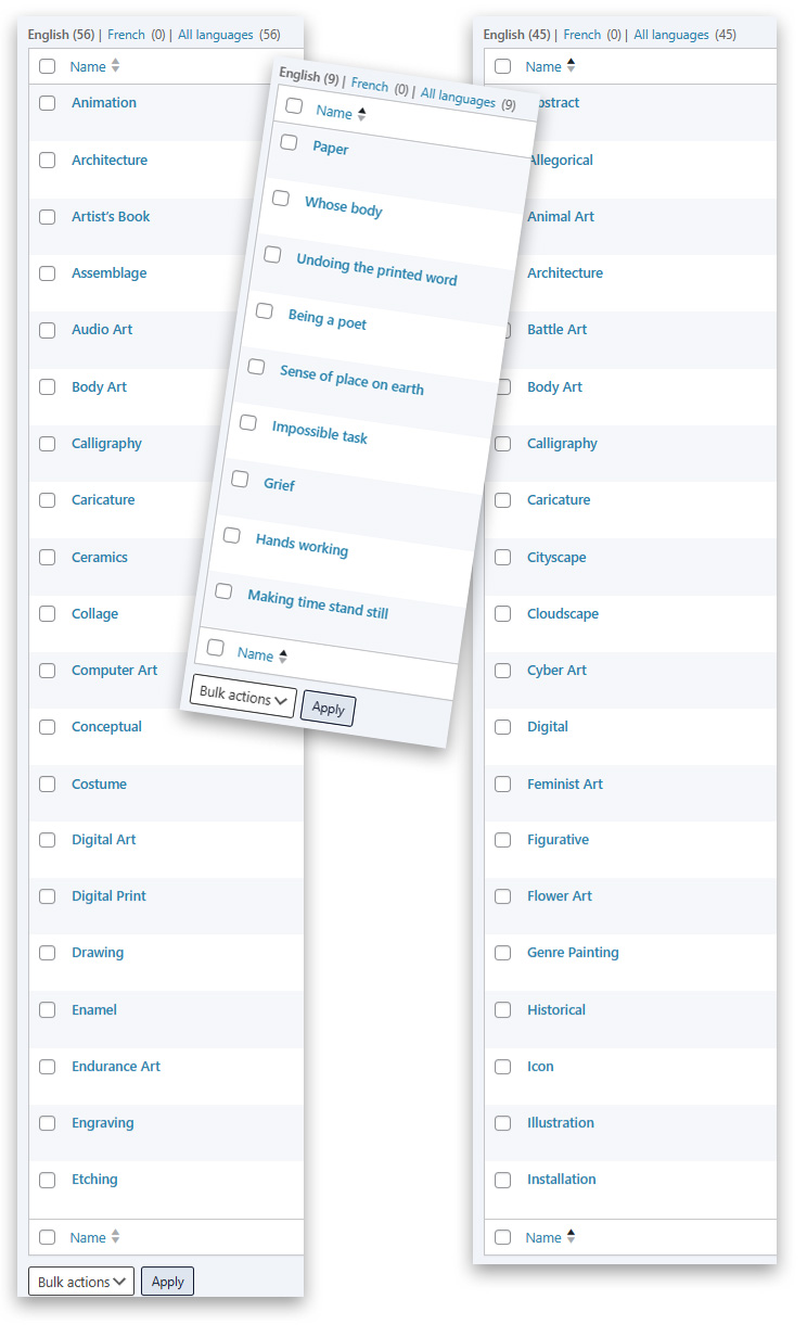
Graphic showing WordPress Admin interface showing list of Artforms, Themes (Karen Trask) and Genres.
All taxonomies have taxonomy items. Here is a sampling of the Taxonomy Items from the first two taxonomies (you can also see them in the screen capture above); they’re built into AOPA-Retrospective.
As for Artwork Themes, those are unique to each artist. The Dedicated Curator can collaborate with the artist to help distill out what these could be.
AOPA-Retrospective takes its name from our belief that an artist’s oeuvre can be digitally organized as if it was being shown in a physical retrospective exhibition.
There are two types of pages in AOPA-Retrospective 1.0 that provide this organisation:
To elaborate on the exhibition comparison… The Taxonomy Main page acts like an exhibition map showing the different thematic galleries. This “map” allows visitors to orient themselves and choose the path they would like to take through the retrospective.
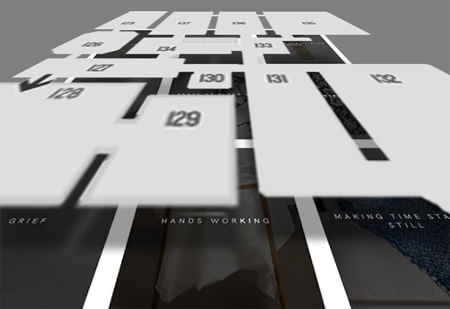
Graphic showing a museum floorplan overlaid on the Taxonomy Main Page from Karen Trask’s website.
Each of the the Taxonomy Item pages correspond to the gallery rooms in the exhibition, showing the artworks that are classified in that grouping.
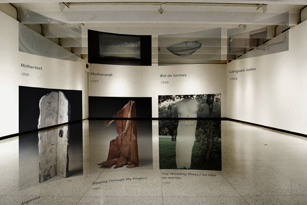
Graphic showing overlay of artwork tiles from Karen Trask’s Grief Theme Taxonomy Item page.
Each gallery on the Taxonomy Item Pages is a dedicated space that invites consideration and appreciation of some aspect of an artist’s oeuvre. It’s where visitors/users, and even the artist can trace connections between artworks, sometimes in unforeseen ways!
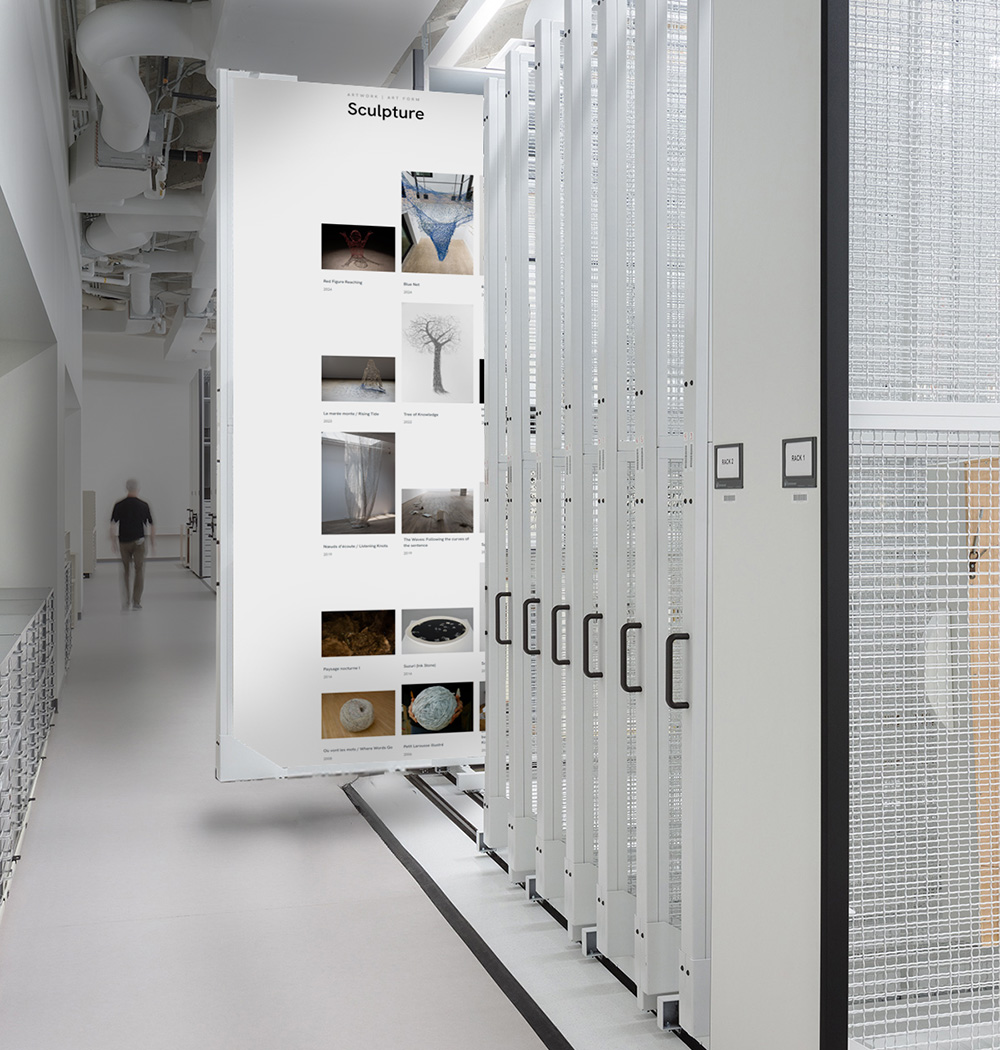
Graphic collage showing Karen Trask’s Taxonomy Single Sculpture page collaged into the storage racks of a museum. exhibition page
In a physical exhibition the artworks can only be grouped in one way; a painting can’t be in two galleries at once. The online retrospective does not have this limitation. The same works presented by Themes can also be grouped in galleries by Art Forms and Genres.
Let’s go back to thinking about curators, critics, art historians and collectors, or “CCACs” for this. By displaying artworks by Art Form or Genre, CCACs can browse an artist’s oeuvre based on their particular needs.
For example, a curator who is preparing an exhibition dedicated to craft materials can navigate to an artist’s Ceramic, Textile Art and Weaving Taxonomy Item pages to see all the artist’s works using those mediums. Similarly, an art historian pursuing in-depth research on Feminist Art or Landscape can go to those Genre Taxonomy Item pages. Or say there’s a collector seeking the perfect piece to complete their collection of watercolours… You get the idea.
Sorting works this way allows CCACs to easily focus in on an artist’s exploration of a given Art Form, Genre or Theme, and even see their evolution over time, because the artworks are ordered chronologically.
So, you see why Taxonomies are such a big deal? Okay! Now let’s see how these pages navigate.
Let’s imagine that you’re browsing an artist’s Artwork Themes Taxonomy Single page and a theme called Nature and the City piques your interest. By clicking on that theme, you enter the Nature and the City Taxonomy Item Single page. This page shows all of the artist’s works that are tagged with “Nature and the City”.
Once there, all of the artworks in Nature and the City are displayed as thumbnail images. When hovering over an artwork’s thumbnail, you can open a continuous, full-screen slideshow that lets you browse through all the images and video documentation for that piece and all the other Nature and the City artworks. Hovering over an artwork’s thumbnail also gives you the option of clicking through to its Artwork Single page for a more in-depth look.
As always, everything comes back to the art!
Check out this video tour that navigates through the Taxonomy pages, the a Taxonomy Item slideshow and link to the artowork page.
Video showing navigation of the Taxonomy pages, taxonomy item slideshow and link to artwork page
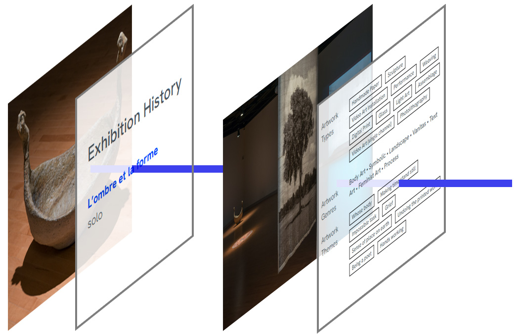
Graphic illustrating the connections between artwork, its exhibition history, the exhibition and its taxonomy items drawn from the artworks
Let’s go deeper into the interconnected navigation that AOPA-Retrospective creates.
Earlier, the Nature and the City Taxonomy Item page took us to the Artwork Single page. As we saw last week, the Artwork Single page’s Exhibition History lists all of the exhibitions that a work was shown in, allowing us to click through to an exhibition of interest. On the Exhibition Single page, we can see the Themes of the works in that exhibition… which can take us to a different Taxonomy Item that we started with, and so on!
Essentially, all of these connections go both ways to make browsing natural. You can go from an Artwork Theme Taxonomy Single page to an artwork, to an exhibition, all the way to another art form… and back again!
It might not be obvious to you how all Taxonomy-Related pages are actually created. It is quite simple, the AOPA-Retrospective templates do all the heavy lifting.
The Dedicated Curator or artist just has to go to the administrative interface for an Artwork, and select the appropriate Themes, Artforms and Genres for that piece using simple checkboxes.
When these Taxonomy Items are selected, they are automatically added to AOPA-Retrospective’s beautifully designed Taxonomy Main page, with links to the Taxonomy Item pages. Likewise, the Taxonomy Item pages, showing all its artworks in the Taxonomy Item, are magically added to the website, with all the related artworks in place.
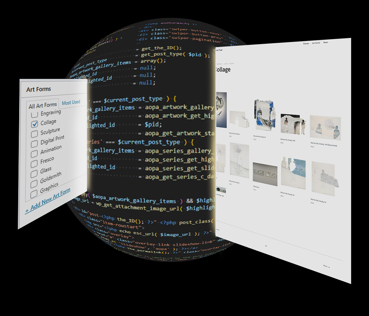
Graphic showing how checking “Collage” in an artwork, goes through Retrospective’s code to create the Collage Taxonomy Item page
In some cases, you may not want to make a big deal of one of the Taxonomies built into your AOPA-Retrospective. For example, if you work exclusively with oil paints or installations, there wouldn’t be a need for an Art Form Taxonomy Main page with only that one item.
In AOPA-Retrospective 1.0’s Preferences, you can decide whether or not you want the Art Form, Genre or Theme pages to be published. If not, all links and navigation to these are removed. The Taxonomy Items are still listed in Artwork and Exhibition metadata, they are just not clickable.
Plus, this can always be changed later to suit your needs. With a click of a button, your Taxonomy pages are there. Easy-peasy!
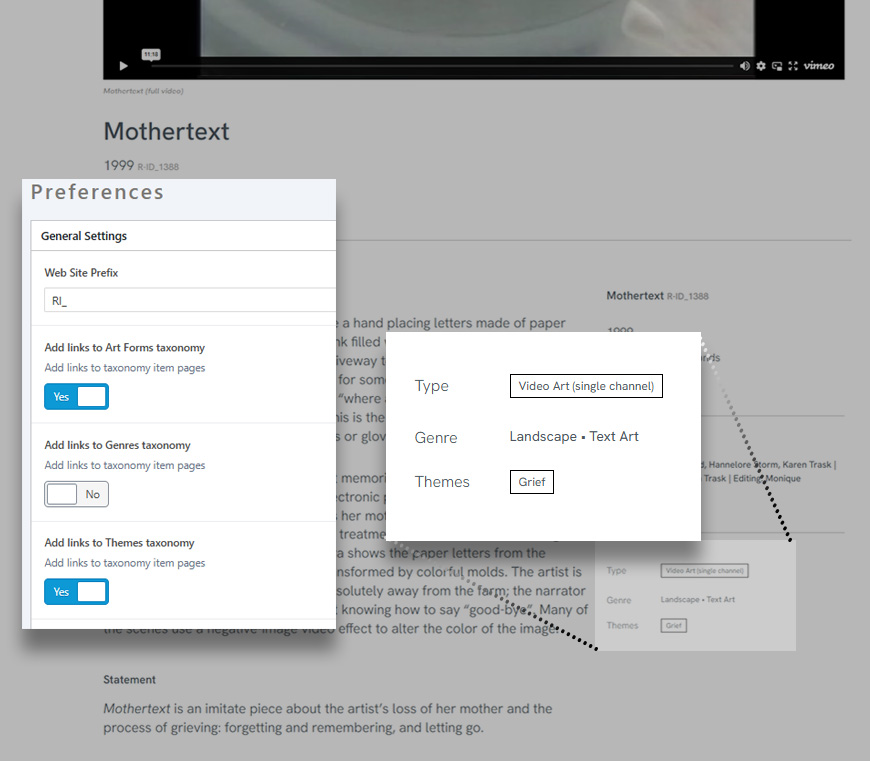
Graphic showing a screen capture of Retrospective’s Preferences and the Taxonomy metadata from an artwork showing linked and not linked Taxonomy Items.
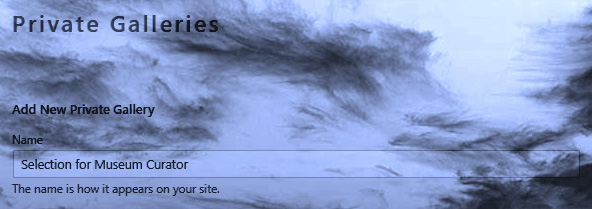
Graphic showing the Private Gallery Taxonomy admin interface still in the clouds.
As we wrap up, I want to let you in on a rumour I heard from Don. Word on the street is that he’s thinking of adding a Private Gallery Taxonomy to AOPA-Retrospective.
He said that Taxonomy Items could be things like “Selection for Museum Curator” or “Works I want to show that buyer I met at the opening”. This would allow artists to make a private gallery with the works they would like to show to a specific curator, critic, art historian or collector. Then, a link to the page could be sent out for the recipient to review — like a personal gallery visit!
So… What do you think? Is this a good idea?
I can’t tell you the number of times I have wanted to do a deep dive into an artist’s works on a particular theme or in a select medium, only to have to browse one long list of artworks and manually pluck out the ones that were relevant to me. As we’ve seen, AOPA-Retrospective 1.0 makes browsing an artist’s oeuvre easy by making ample connections between works, inviting all kinds of art appreciation.
Thanks for spending another week with us! It’s always a pleasure to share these updates. Every week, I hope you can picture the AOPA-Retrospective 1.0 platform a little more clearly… and get a lot more excited for the launch!
Feel free to get in touch with any questions or feedback. You can shoot us a message over at our contact page. We love hearing from you!
Can’t wait for the AOPA-Retrospective launch? Want to shout it from the rooftops? Share the newsletter signup page! It’s the best way to get friends and colleagues up to date with all of the platform’s newest developments.

Mya Fernandes-Giles, AOPA Dedicated-Curator Assistant
Master’s student in Art History at Concordia University, working on a project that relies heavily on alternative archives. Has a great appreciation for record-keeping and cultural preservation, especially amongst little-known artists and communities. Recipient of the Concordia Merit Scholarship, the Guido Molinari Prize in Studio Arts and the Sarah Leaney Award in Ceramics and Fibers.
Artist Online Presence and Archiving (AOPA), provides professional online archiving and web-development services to mid- to late-career contemporary visual artists. AOPA was founded in 2023. It grew out of the freelance work of Don Goodes, who was an art critic and curator in Canada for a decade before moving over to web development in the cultural sector. AOPA delivers its services via a growing team of freelance writers, curators and designers spread across Canada. Over the past 2 years, the core team has been developing a flexible and comprehensive online platform called AOPA-Retrospective, a key tool in delivering AOPA’s services. AOPA-Retrospective is designed to fulfill the needs of contemporary artists, for both archiving and the online presentation of their oeuvre in the spirit of the catalog-raisonné.
For questions or inquiries see our contact page. We would love to hear from you.
choose your preferred method of communication