
AOPA News

2021

Artist OPA Services Promo Video on Youtube

19 February, 2021

Hey everyone,

So it has been a week since I did the fist launch. That involved me looking into my Google contacts and writing my closer artist friends and acquaintances. I have had a lot of good feedback. People particularly liked the promo video covering our services and just saying what AOPA is all about. You can see it embedded above, or on the services page, or on the AOPA Youtube Channel.

The video is a DIY project. I have some video chops from way back in Video Sketchbook class with Jan Peacock at the Nova-Scotia College of Art and Design in the eighties, and the pilot I did with Anne Marie Léger at the Banff Centre TV Studio for a TV show on how to make art in the mid nineties. Over the past years, I have done videos on an off for work and for my daughter’s theatre classes. All that gave me the skill set I needed.

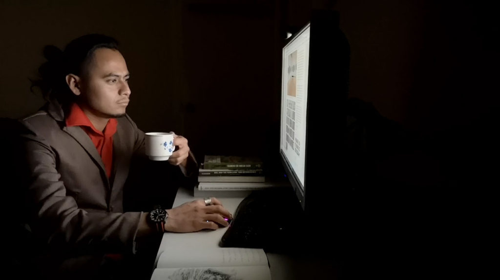
I was going to get my brother, who works for radio to do the narration, but he was too busy. So, I just did it myself. I needed a shot of a young-curator-looking person looking at one of our websites. Again, after trying to get someone to do that for me, I ended up doing it myself. My housemate seemed to fit the role perfectly. He was great. We basically reproduced a shot from one of the very pricey stock video services. The great thing about running your own business is that it lets you and the people around you discover talents we don’t usually get to use.
I did purchase the music from premiumbeat.com. The piece is “Patient” by Yan Perchuk. It’s musically interesting and not too corporate. I was also thinking of using “Zero Hour” by Hania Rani, a composer from Poland that I recently discovered, but I never heard back from her record company and had to get the video out there. If I do, and it is not too expensive I will do an alternate version with her music. Really love the piece. Check out the full album Home on her bandcamp page.

Anyway, I am really happy with the results. I am making a pitch for two clients as a result. Very happy.

Behind the scenes: An Online-Retrospective Catalogue

21 January, 2021

I am so happy with Mariela Borello’s Online Retrospective Catalogue. AOPA is particularly proud of the outcome.

There is so much content here, 127 works, 9 series, and lots of information on each. But by proper organization, well-considered UX and visual design, and great programming, the site does not overwhelm. Users are always oriented. It looks simple despite the complexity. That’s success.

The process of organizing the content for Mariela’s site was super interesting, trying to come up with a solid structure for the presentation of her complex and multifaceted body of work, spanning over two decades. Proper information design is one of the specialties we bring to making websites for artists. It reminds me the relationship I had with artists when I did curatorial projects, minus the fun of hanging the show, of course, but without the physical limitations of the gallery space.

It took some fancy programming to make it all work. My precious collaborators at CreativeDot provided this magic (they can make content do anything!). All artist sites made at AOPA use a database and what are called dynamic templates. It is different than something like SquareSpace, where each page must be made by hand, which is okay if you are making a promotional site with a few works, but not so great for a website with over a hundred works, and one that is to be updated regularly.

The programmers make the templates using “queries” that call on the database to provide all the content required to make a page. Mariela sometimes but not always works in series. So to present this mix required some complex queries. Especially challenging was building the query for what is to be seen in the slideshow.

In the end, clicking on the “Slideshow” link in any of the round tiles, whether it represents a series or an individual work, takes us with ease on a clickable tour through all the works in that section, giving us an overview, like walking through a gallery. And if users want to go deeper they can either go to the series pages or the single work pages, where all the info on that work is to be found, right down to the exhibition history and the artist’s statement. Not bad!

I have to mention that we benefited from the well seasoned print-catalogue designer Rodolfo Borello, who had a big hand in creating the visual vocabulary. AOPA just had to bring these ideas over to the digital environment.

I could go on an on but if you are interested we invite you to watch the video above to hear Don and Mariela discussing the process of making of her online retrospective catalogue, and commenting on its various features.

CONTACT US FOR A CONSULTATION OR JUST TO ASK QUESTIONS AND THROW AROUND IDEAS

choose your preferred method of communication

Client Feedback

I love your attention to detail, be it in the design, the images, editing text, improving on my writing. Your background in writing is an extra asset to your service. You were very professional in the whole process. You take the whole of the client's needs into consideration and that is what makes your service unique. You care, and it shows in the creation of a beautiful product. I felt you went beyond what was needed to make the site spectacular.

Mariela Borello, Montréal artist

I have so appreciated working with Don at AOPA to create my website. His knowledge of navigation on various screen sizes, his understanding of clients' needs, combined with his attention to detail and endless patience makes working with Don such a pleasure. My online presence has enabled my work to be professionally presented to gallerists and clients alike, which in turn has resulted in exhibition invitations and exposure in print, and has got my work out to a much larger audience . I trust Dons judgement, appreciate his professionalism and I have and do highly recommend collaborating with him on any project.

Jennifer Small, Montréal artist

I am very pleased with my site, its appearance and functionality. I was also happy that you showed me how to do some of the work myself so I can do the updating. You aren’t some young hotshot so I felt like I would be less likely to be judged for my ineptitude with all things computer-related. I am particularly pleased that people continue to be able to find it. I know that is something you put a lot of work into.

Sarah Stevenson, Montréal sculptor