514-622-9917
514-622-9917
 News
News23 January, 2025
Video tour of Exhibition Single. Watch on Youtube
Weeks to Launch: 1 + 4
Belated happy New Year from all of us here at AOPA, and a warm welcome back to the AOPA-Retrospective 1.0 Launch newsletter!
We want to start by acknowledging that we slacked off with our newsletters. Things remain tremendously busy behind the scenes. Between holidays and the drive to keep production of AOPA-Retrospective 1.0 moving forward, these updates got put on the backburner. Let’s get you caught up, shall we?
Our team has continued to make progress on the AOPA-Retrospective platform, but it is always more work than expected. As such, the launch will be moving ahead by one month — with additional updates from me to keep you company during the wait!
This week, we will be looking at the Exhibition Single Page and what delicious features it brings to the table for both artists and that important group of curators, critics, art historians and collectors.
I want to give a big thanks, once again, to Karen Trask for giving us permission to use screen captures from her website in development with AOPA. Enjoy her amazing work.
Like our newsletters? Share the news! New readers can sign up here!
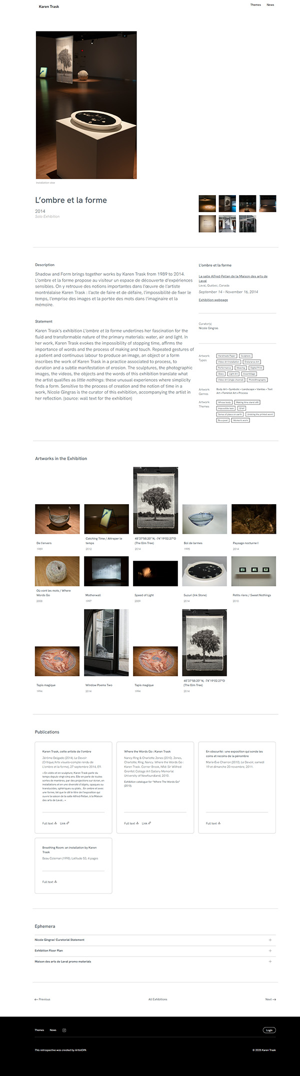
Screen capture of the exhibition page for Karen Trask’s Ombre et la forme exhibition.
You may have noticed that our first three newsletters were all about artworks. This was no coincidence: artworks are AOPA’s raison d’être. Today, we’re looking at the next most important thing: exhibitions… those times when your artworks have traveled out of studio into the public eye.
For artists, it’s a time of mixed emotions. There is a satisfaction in seeing the works grouped together, in seeing your body of work as a whole. When artworks are exhibited, they’re out in the world to be seen, experienced, and yes, even critiqued.
These moments gives legitimacy and special status to the artworks exhibited, serving as a form of validation for both artists and their works.
Many artists have scattered archives related to their exhibitions. AOPA-Retrospective’s Exhibition Single template provides a tidy container to organize all of this information in digital form.
Exhibition Single pages tell key users, especially CCACs (curators, critics, art historians and collectors) about these important moments. They are meant to answer their questions and satisfy their curiosity by offering as many details and as much documentation as possible.
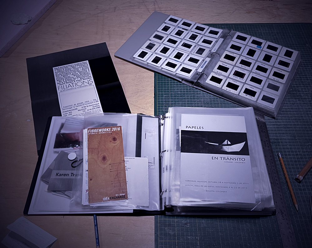
Karen Trask’s exhibition binder and slides
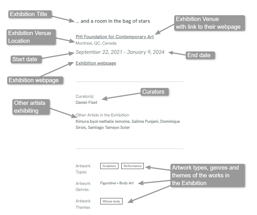
Let’s start our tour of the Exhibition Single Page with that wealth of information of the type that we call metadata. Check out the labels in the screen capture below from Karen Trask’s exhibition page for … and a room in the bag of stars. They describe some of the basic information that can be entered in this template.
Documenting this data is a huge deal! By inputting it into Exhibition Single, the information is centralized and organized in a reliable and easily retrievable way.
Undertaking this task may appear daunting. Some data may seem lost to time, or hidden somewhere in the artists’ distant memory. This is where AOPA’s Dedicated Curators come in.
The Dedicated Curator collaborates with the artist to tease these details out of old exhibition invitations, articles, catalogs and the hidden corners of the internet to fill in the gaps. This is especially satisfying, as this extra effort can seriously solidify information.
For curators, critics, art historians, and collectors (CCACs) the centralization of this basic metadata makes their work significantly easier and more efficient. Not only does the Exhibition Single Page include all of the information they need to do their work, but it also connects data, allowing one to trace chronology, draw connections between artworks, and follow the artist’s work with collaborators and curators.
Exhibition Single has optional data fields for exhibition descriptions and statements. Descriptions are essentially what it says on the tin: a straightforward description of what one would see in the exhibition. A statement is, of course, more personal, digging into the thoughts behind the grouped works.
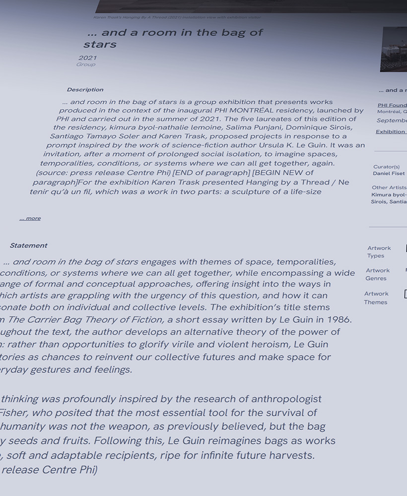
Screen capture of the Descriptions and Statement from Karen Trask’s … and a room in the bag of stars exhibition page
For Artists, the Description and Statement fields:
For CCACs (curators/critics/art historians/collectors):
Next up is the audio-visual documentation of the exhibition. This includes installation photos and walk-through videos, all selected and arranged to best tell the story of the show, establish the location of the works in the gallery, and even give a sense of the space and the atmosphere. All media elements can be viewed in a slideshow.
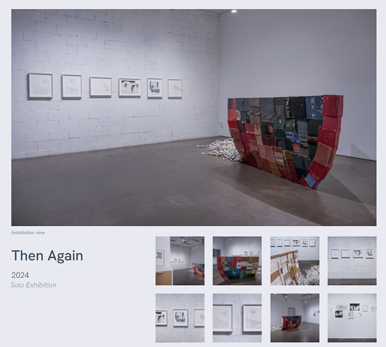
Screen capture of the exhibition views from Karen Trask’s Then Again exhibition page
The Dedicated Curator works with the artist to assemble digital documentation of these elements and begin putting things together. The process often gives the artist the opportunity to step back and realize the scope of their accomplishments, and to take a much-deserved walk down memory lane.
In some cases, translating an exhibition to a digital context will also reveal the documentation that’s missing to properly portray the show. In this case, the Dedicated Curator works closely with the artist to fill in the gaps. For example, digging up old slides to be digitized, researching images from the exhibiting gallery’s archives, finding publications, and even hiring a photographer.
For CCACs (curators/critics/art historians/collectors) it offers:
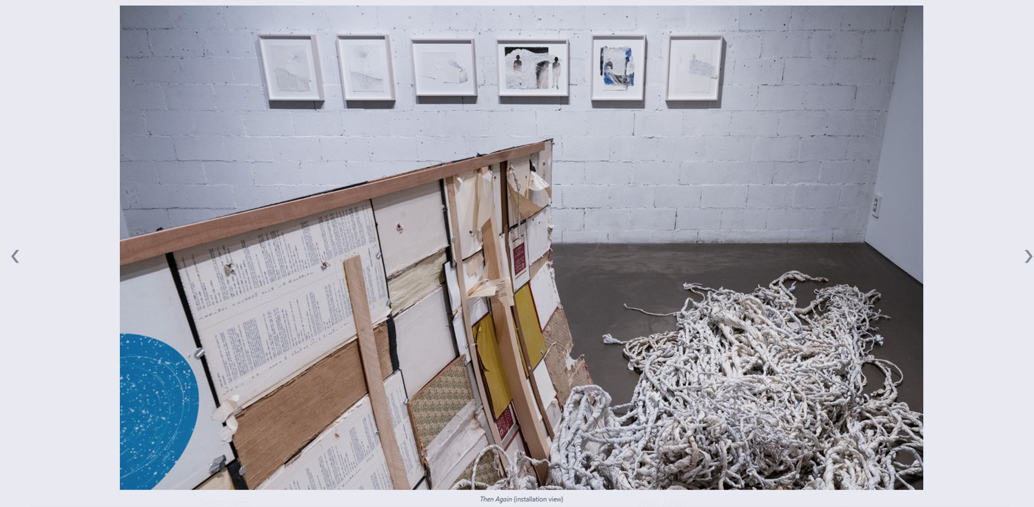
Screen capture of the slideshow showing an installation view of Karen Trask’s Then Again exhibition
And now the artworks in the exhibition! In the Exhibition Single page, every artwork that was shown can be listed with images and links to their respective Artwork Single pages. That’s right: artworks are directly connected to the exhibitions they were featured in, with more of their story only a click away.
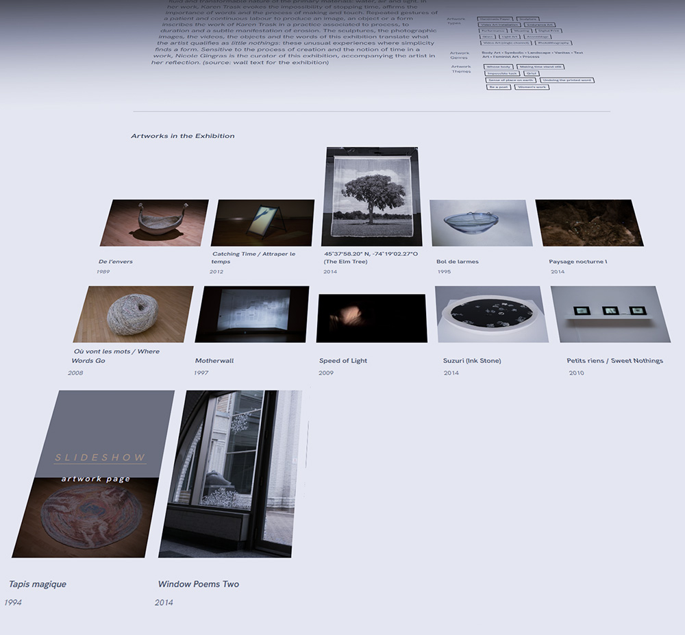
Screen capture of “Artworks in the Exhibition” block for Karen Trask’s L’ombre et la forme exhibition. Note the hover state over the work Tapis magique showing the slideshow and artwork page links.
There is not always a record of which artworks were included in an exhibition. Sometimes a list might have been kept by the artist, but often, we rely on their memory or piece together information from photos. This makes the Exhibition Single Page an opportunity to accurately document and preserve that part of the artist’s history.
For CCACs the Artworks in the Exhibition block offers:
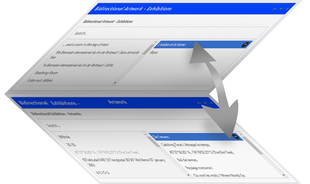
Graphic showing Bi-directional Artwork and Exhibitions interconnected data fields
A special feature of Exhibition Single is that it uses a bi-directional data field to connect artworks to the exhibitions. The same field is found in Artwork Single. The link is made where ever it is most convenient in the workflow. This saves the artist and Dedicated Curator a lot of trouble! With just one click, the exhibition can be added to the artwork’s Exhibition History on the Artwork page or to the Artworks in the Exhibition block on the Exhibition page.
Publications are another standout feature on the Exhibition Single Page. This is where published catalogs, reviews, and articles pertaining to an exhibition or any of the works can be connected and displayed.
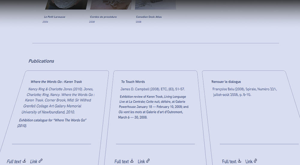
Publications block from Karen Trask’s Où vont les mots exhibition page.
This holds immense value for the artist! These texts can easily slip out of sight. By gathering and centralizing all writing on the exhibition and its works, the artist can get a bird’s eye view of the buzz around their work.
For CCACs, the value of this section is clear. Tragically, it can be exceedingly difficult to track down writings about living artists. Presented all in one place, CCACs can access all collected texts about a given exhibition with full-text files and clear attribution to their respective writers and publications.
And now for my favourite, the Ephemera block. This is an extra special feature of Exhibition Single. It provides a place for any extras, including scans of invitations and other related print materials, photos documenting the installation or the vernissage… Anything the artist wishes to share that is not strict documentation of the exhibition or an official publication can be found here, in the form of documents, media, or text.
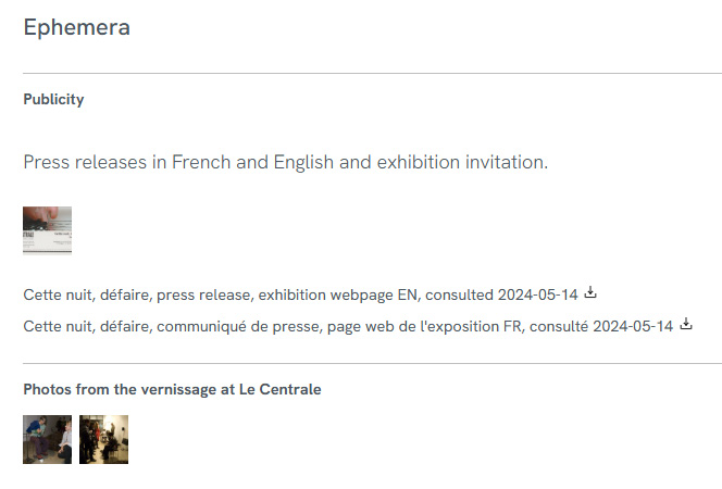
Publications block from Karen Trask’s Cette nuit défaire exhibition page.
For Artists the Ephemera block:
For professional CCACs the Ephemera block:
And to finish off, let me quickly show you two other features of AOPA’s Exhibition Single template.
The first is the “Publish to Retrospective?” radio button that lets you decide which exhibitions you would like to feature on your website’s Major Exhibitions page. If the answer is “no”, the exhibition’s minimum metadata can still be recorded in AOPA-Retrospective for archiving purposes as well as for use in the automatically-generate “Exhibitions” section of the artist’s CV.

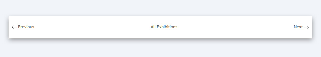
Finally, a quiet achiever of AOPA-Retrospective’s Exhibition Single Page is the pagination. On the bottom of every exhibition page, the user can click to the next or previous exhibition. Pagination links let users easily navigate through all the featured exhibitions, rather than having to constantly click back to the main page. This enhances the user experience with an intuitive flow, and best of all, fewer clicks!
Tracing the life of an artwork from its studio to the spotlight is no easy task! The process of creating your exhibitions to bring out the best in the artworks took a lot of time, patience and skill. This is something AOPA aims to accurately reflect in the thoughtful design of its Exhibition Single Page.
A big thank you, as always, for reading — and especially for sticking around after our holiday hiatus! Shoot me a message if you have any feedback. Always good to hear from our cherished reader. Get in touch by clicking here!
Next week, if all goes well, we’ll be back. Given how busy things are, we don’t want to make any promises about the upcoming topic… Whatever the case may be, however, I look forward to keeping you updated on all of our newest developments!
If you’re excited about the return of our newsletters, consider sharing with a friend. Sign up for this newsletter here.

Mya Fernandes-Giles, AOPA Dedicated-Curator Assistant
Master’s student in Art History at Concordia University, working on a project that relies heavily on alternative archives. Has a great appreciation for record-keeping and cultural preservation, especially amongst little-known artists and communities. Recipient of the Concordia Merit Scholarship, the Guido Molinari Prize in Studio Arts and the Sarah Leaney Award in Ceramics and Fibers.
Artist Online Presence and Archiving (AOPA), provides professional online archiving and web-development services to mid- to late-career contemporary visual artists. AOPA was founded in 2023. It grew out of the freelance work of Don Goodes, who was an art critic and curator in Canada for a decade before moving over to web development in the cultural sector. AOPA delivers its services via a growing team of freelance writers, curators and designers spread across Canada. Over the past 2 years, the core team has been developing a flexible and comprehensive online platform called AOPA-Retrospective, a key tool in delivering AOPA’s services. AOPA-Retrospective is designed to fulfill the needs of contemporary artists, for both archiving and the online presentation of their oeuvre in the spirit of the catalog-raisonné.
For questions or inquiries see our contact page. We would love to hear from you.
28 December, 2024
Weeks to Launch: 5
Whether you’re celebrating with loved ones, braving seasonal deadlines, slowing down and taking stock, or just trying to survive the crazy winter weather, we truly hope you’re able to take time and enjoy yourself. Tis the season!
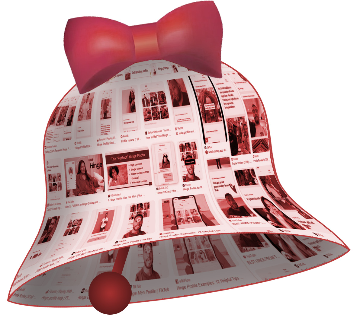
This week, in honor of cuffing season, we thought it’d be a good time to unwind and invite you to get to know AOPA from another angle. We here at AOPA have enlisted the help of ChatGPT to generate some prompts inspired by those on the popular dating app Hinge. I hope it’ll show you why AOPA-Retrospective could be your perfect match!
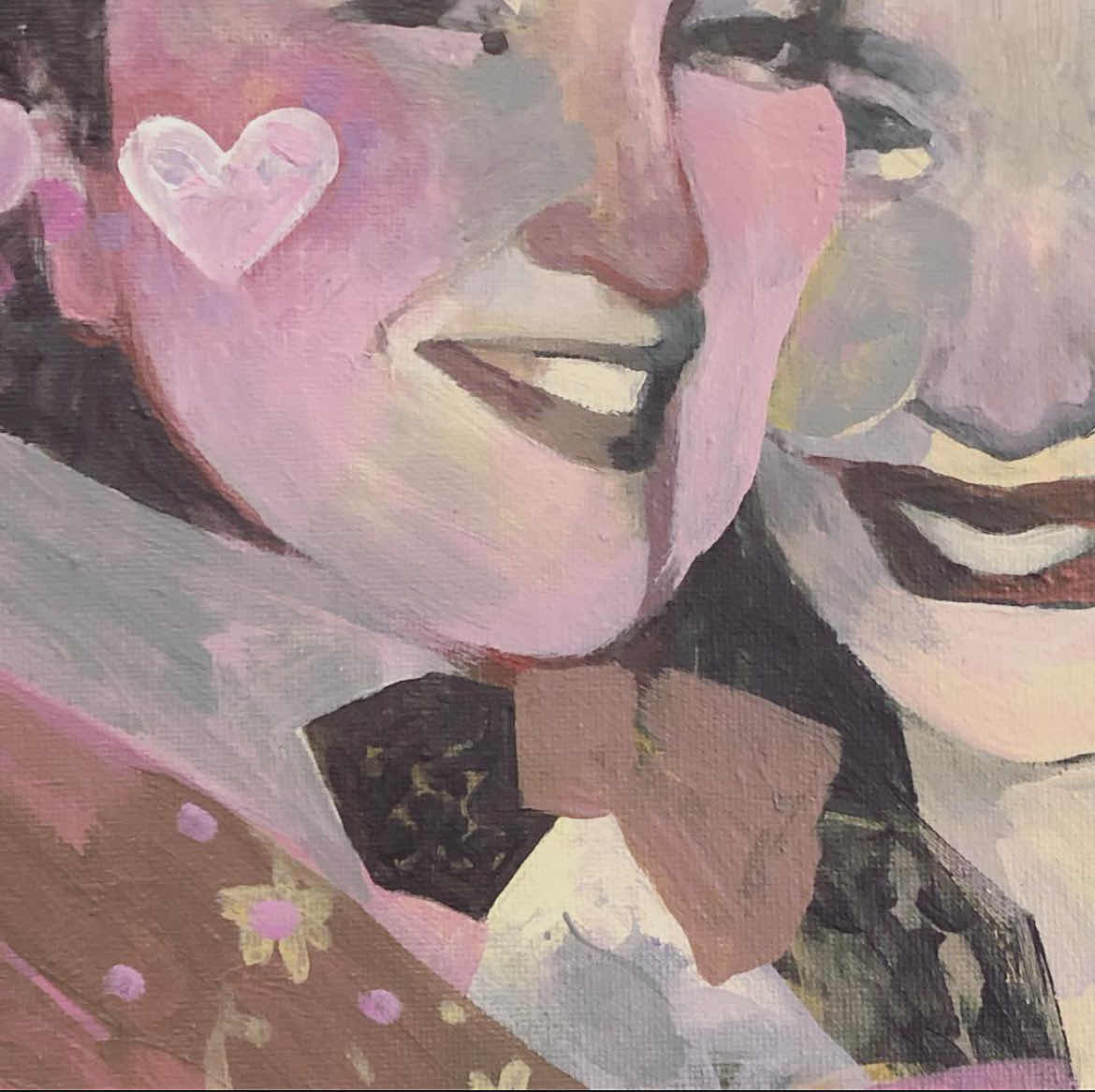
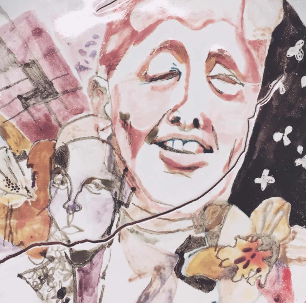
So pull up with a cup of hot cocoa, cozy up by the fire (or wireless speaker), and enjoy. (btw, the artworks are by me :-)!)
Enjoying our newsletters? Consider gifting the good news to a friend! New readers can sign up here!
Meet the AOPA-Retrospective platform.
“I recently discovered that…”
“My simple pleasures…”
“I’m weirdly attracted to…”
“Your passion…”
“Dating Me Is Like…”
So… do you think it’s a match?
Thank you for reading, and have a wonderful holiday from all of us here at AOPA! You’ll be hearing from us again in the New Year. In the meantime, stay warm, and stay excited! I’ll be looking forward to keeping you apprised of all the platform’s developments as we get closer to AOPA-Retrospective’s 1.0 launch.
Have a suggestion? Maybe a question? Get in touch! We’d love to hear from you.
If these prompts have you eagerly awaiting our upcoming launch, consider sharing the word! Anyone interested can sign up for this newsletter here.
Artworks in order of appearance: Mya Fernandes-Giles, After Hours (detail), acrylic on canvas; Community Platter (detail), majolica on terracotta
Mya Fernandes-Giles, AOPA Dedicated-Curator Assistant
Master’s student in Art History at Concordia University, working on a project that relies heavily on alternative archives. Has a great appreciation for record-keeping and cultural preservation, especially amongst little-known artists and communities. Recipient of the Concordia Merit Scholarship, the Guido Molinari Prize in Studio Arts and the Sarah Leaney Award in Ceramics and Fibers.
Artist Online Presence and Archiving (AOPA), provides professional online archiving and web-development services to mid- to late-career contemporary visual artists. AOPA was founded in 2023. It grew out of the freelance work of Don Goodes, who was an art critic and curator in Canada for a decade before moving over to web development in the cultural sector. AOPA delivers its services via a growing team of freelance writers, curators and designers spread across Canada. Over the past 2 years, the core team has been developing a flexible and comprehensive online platform called AOPA-Retrospective, a key tool in delivering AOPA’s services. AOPA-Retrospective is designed to fulfill the needs of contemporary artists, for both archiving and the online presentation of their oeuvre in the spirit of the catalog-raisonné.
For questions or inquiries see our contact page. We would love to hear from you.
choose your preferred method of communication