AOPA News

ARTICLE 

Bringing Contemporary-Art-Publication Design into Retrospective

24 November, 2023

The design vocabulary for AOPA’s Retrospective platform takes the last 50+ years of print publications in the art world as a primary reference: specifically the rich design conventions of contemporary art catalogs and artist monographs.

With the recent and most happy addition of the accomplished freelance designer Alex Tench to the AOPA team, the visual design process has begun. Our objective is to create a basic classic graphic theme for Retrospective that will be available to all our clients. The point of departure for this work was a concentrated round of research.

The First Step: Research

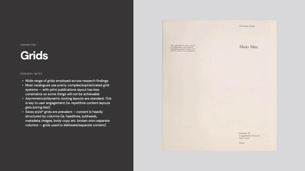
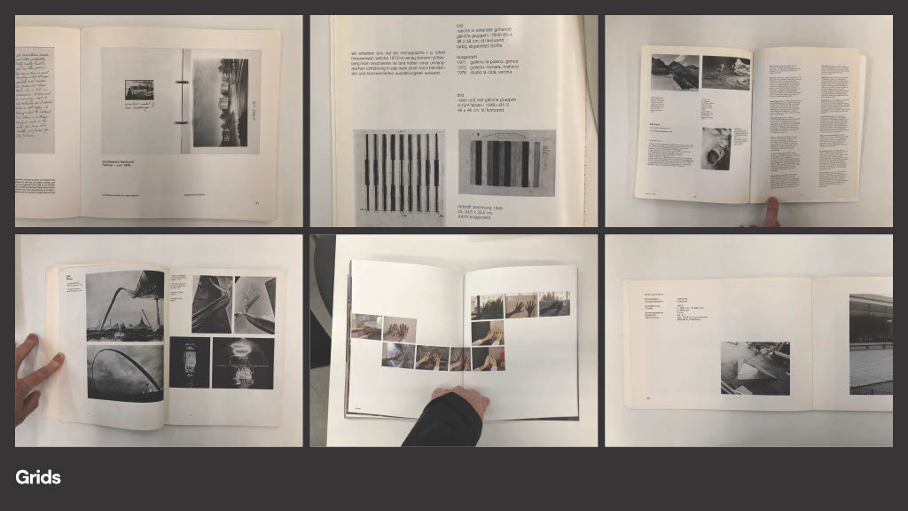
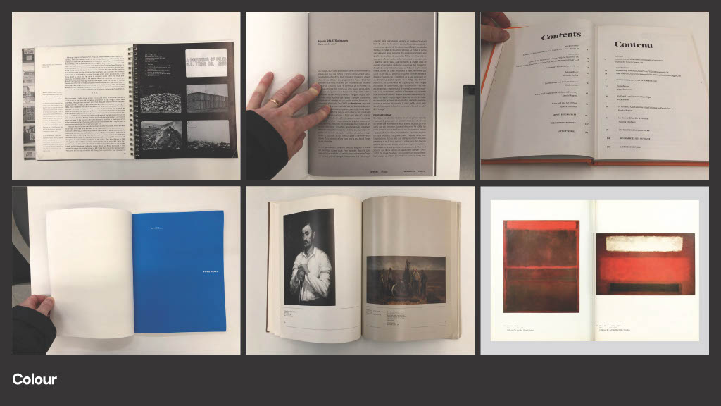
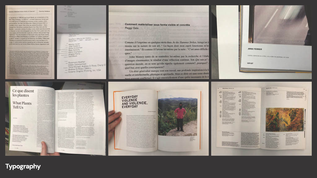
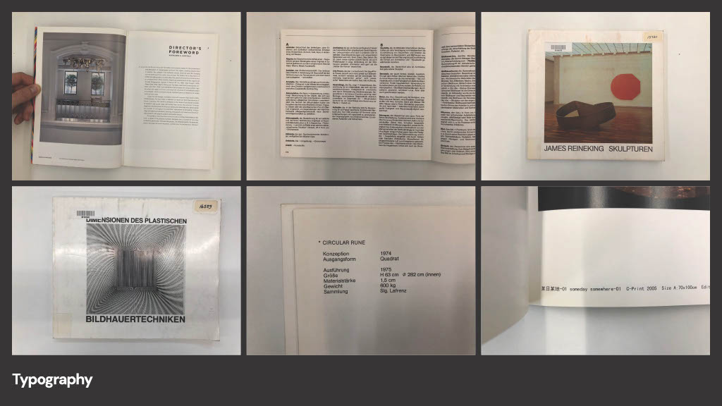
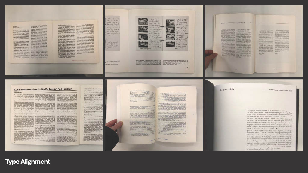
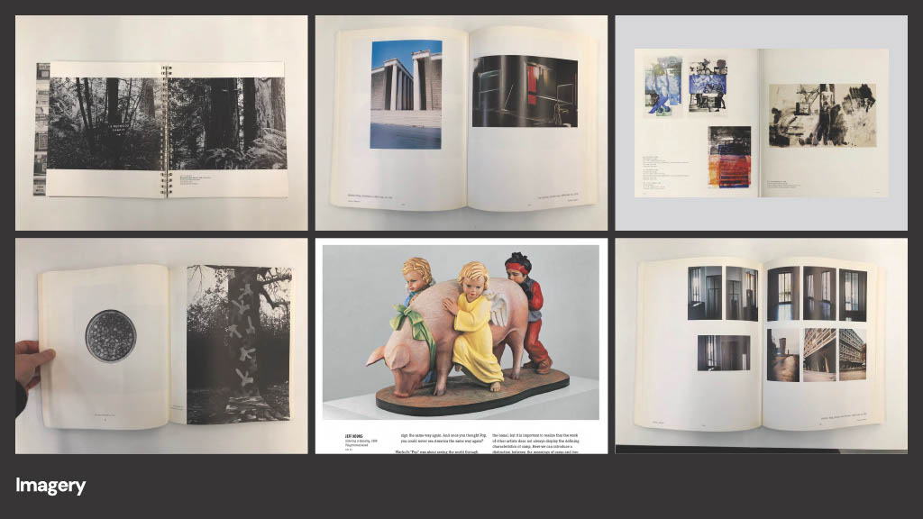
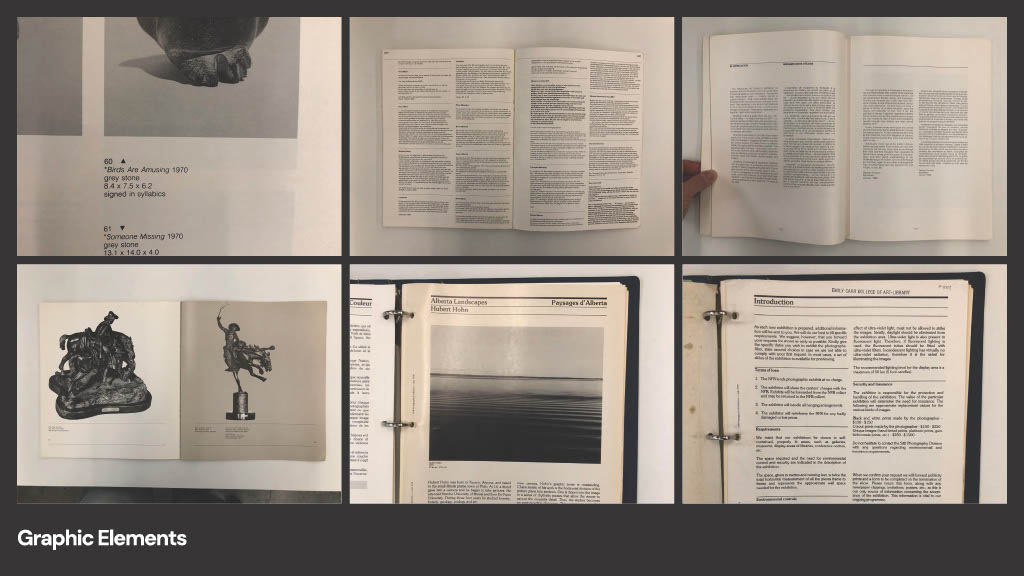
Last week, Alex went on a field trip to the Emily Carr University of Art + Design library and Don did the same at Artext and the Université du Québec à Montréal’s Bibliothèque des arts. We perused many dozens of contemporary art catalogs, from the 1970s to the present, with the intent of distilling out recurring design choices.

Page from Outside the Palace of Me: Shary Boyle, Canadian Art Institute, 2021.

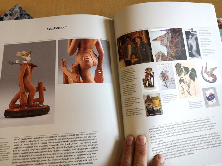
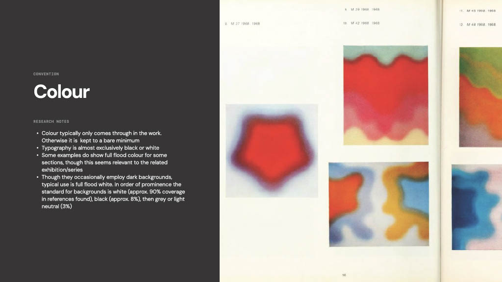
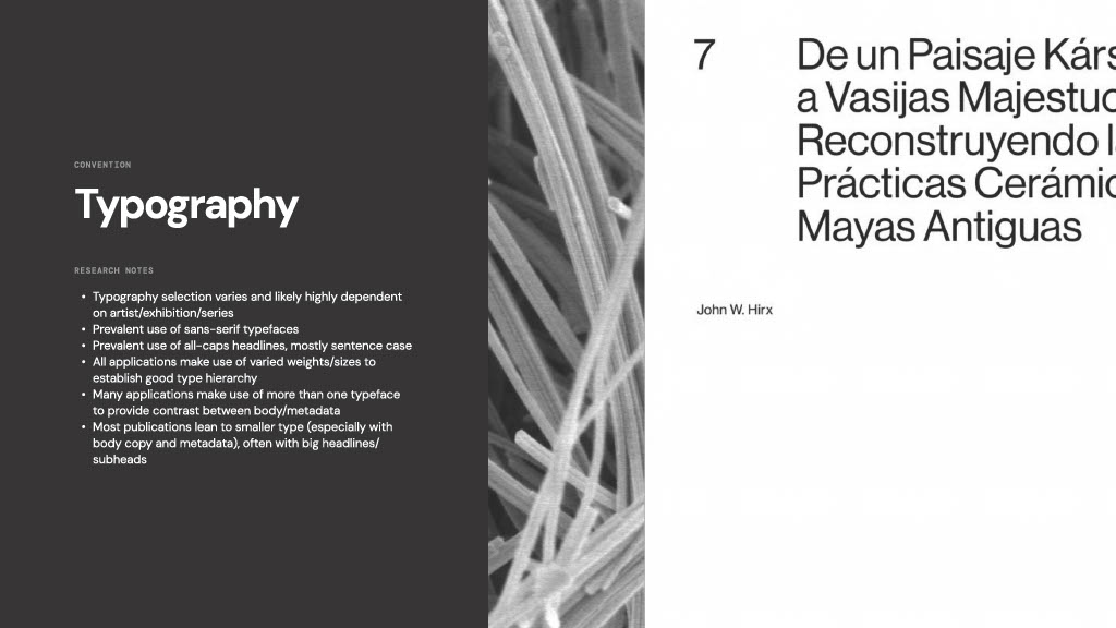
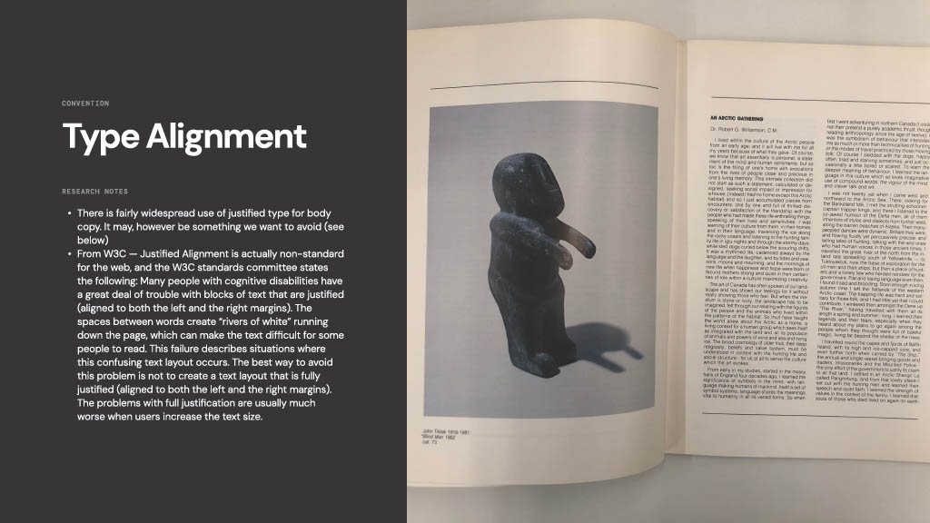
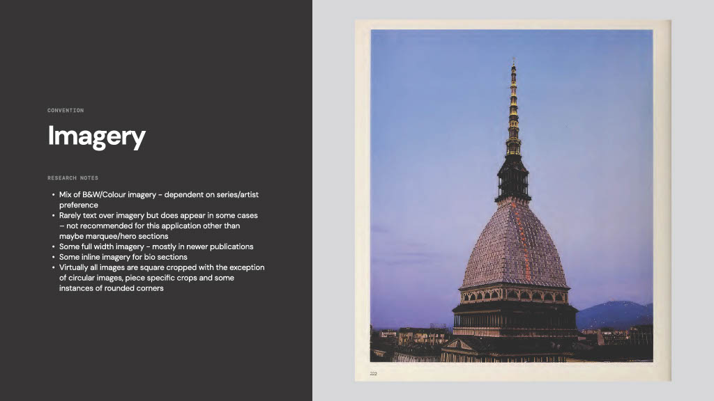
We quickly found that there were many best practices for presenting information and images that the unsung army of talented and committed art-publication designers have returned to over the years. We identified the visual treatments that made the content easy to understand and read, and that struck the eye as looking fabulous and beautiful. Then we gave consideration to which of these design conventions showed promise in making the transition from paper to screen. What’s relevant on the physical page does not necessarily translate to monitors or mobile devices.

Design in the Service of Art

Before getting into the research findings, this is a good place to reiterate a fundamental principle that is applied to all AOPA’s design work, whether it is visual or in terms of usability. We take as a given that our design decisions must not only put the artwork first, but also must enhance, where possible, users’ understanding of the artist’s creative project. We want people to leave feeling they are closer to the artwork.

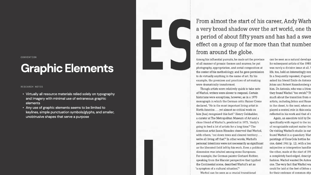
For graphic design this means it must, in most cases, be quiet, sit back. It should only come forward if a bolder graphic treatment makes sense for the artist’s work. The design is in the service of the art, not vice versa.

The Research Findings

Here are some of the findings that Alex put together, which will guide his design work on the classic Retrospective theme…

Considered Use of White Space

Convention: Whitespace


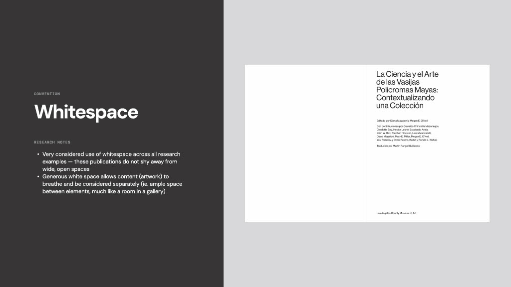
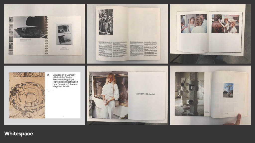
Convention: White Space (examples)

Sophisticated Grids

Convention: Grids
Convention Grids (examples)
Convention: Grids (Swiss Style)

Restrained Use of Color

Convention: Color
Convention: Color (examples)

Typography

Convention: Typography
Convention: Typography (examples)

Type Alignment

Convention: Type Alignment
Convention: Type Alignment (examples)

Predominance of Imagery

Convention: Predominance of Imagery
Convention: Predominance of Imagery (examples)

Limited Use of Graphic Elements

Convention: Graphic Elements
Convention: Graphic Elements (examples)

CONTACT US FOR A CONSULTATION OR JUST TO ASK QUESTIONS AND THROW AROUND IDEAS

choose your preferred method of communication

Client Feedback

I love your attention to detail, be it in the design, the images, editing text, improving on my writing. Your background in writing is an extra asset to your service. You were very professional in the whole process. You take the whole of the client's needs into consideration and that is what makes your service unique. You care, and it shows in the creation of a beautiful product. I felt you went beyond what was needed to make the site spectacular.

Mariela Borello, Montréal artist

I have so appreciated working with Don at AOPA to create my website. His knowledge of navigation on various screen sizes, his understanding of clients' needs, combined with his attention to detail and endless patience makes working with Don such a pleasure. My online presence has enabled my work to be professionally presented to gallerists and clients alike, which in turn has resulted in exhibition invitations and exposure in print, and has got my work out to a much larger audience . I trust Dons judgement, appreciate his professionalism and I have and do highly recommend collaborating with him on any project.

Jennifer Small, Montréal artist

I am very pleased with my site, its appearance and functionality. I was also happy that you showed me how to do some of the work myself so I can do the updating. You aren’t some young hotshot so I felt like I would be less likely to be judged for my ineptitude with all things computer-related. I am particularly pleased that people continue to be able to find it. I know that is something you put a lot of work into.

Sarah Stevenson, Montréal sculptor